Brand Experiences
High-end print, digital, and environmental design that carries established brands across events and campaigns.
BRAND & EXPERIENTIAL DESIGN

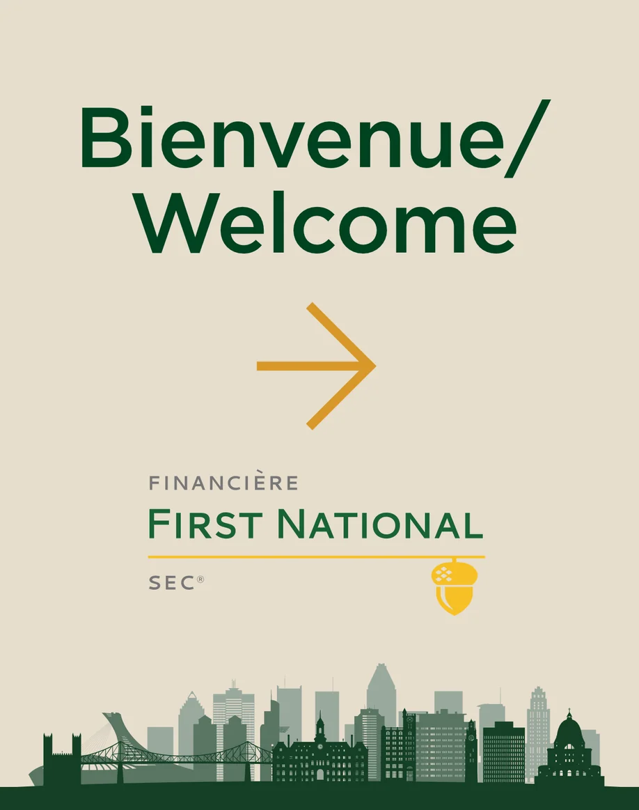
01 / CONTEXT
The brand already exists. The challenge is making it work everywhere.
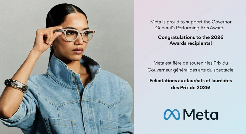
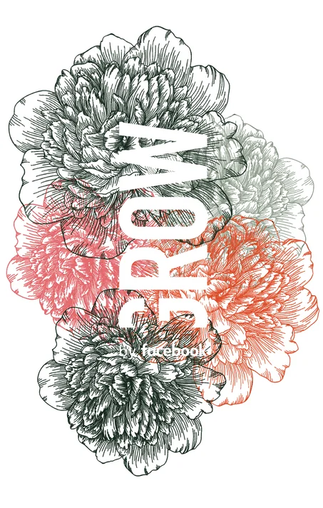
Most projects begin with an established identity, campaign, or set of brand standards. My role is to understand that visual language quickly and extend it across whatever the project requires, from print and social content to signage, environmental graphics, and large-format installations, while keeping every execution recognizably on-brand.
DESIGN PRINCIPLE
Brand stewardship, not reinvention.
The goal is to preserve what makes a brand recognizable while adapting it intelligently to new formats, environments, and content.
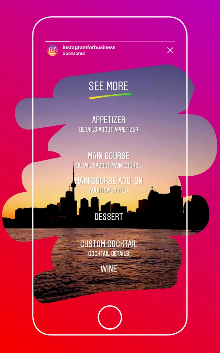
INSTAGRAM FOR BUSINESS
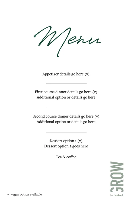
A printed event menu that brings Instagram’s Stories interface into the room, connecting campaign imagery and familiar digital interactions with a physical brand experience.
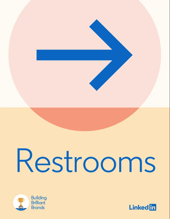
Event wayfinding that extends LinkedIn’s campaign colours and graphic shapes into the venue, using bold arrows and clear typography to help guests navigate.
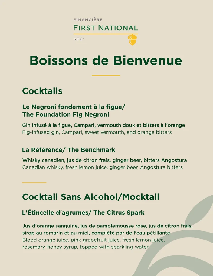
FIRST NATIONAL
A bilingual drinks menu that carries First National’s identity into event collateral, balancing English and French content through consistent typography and a clear reading hierarchy.
02 / BRAND APPLICATION
One visual language, many different formats.
Large-format graphics establish the visual system across entrances, elevators, walls, wayfinding, and branded environments.
01
Environmental
Window graphics, furniture decals, elevator wraps, stage graphics
02
Menus, signage, programs, ads, handouts
03
Wayfinding
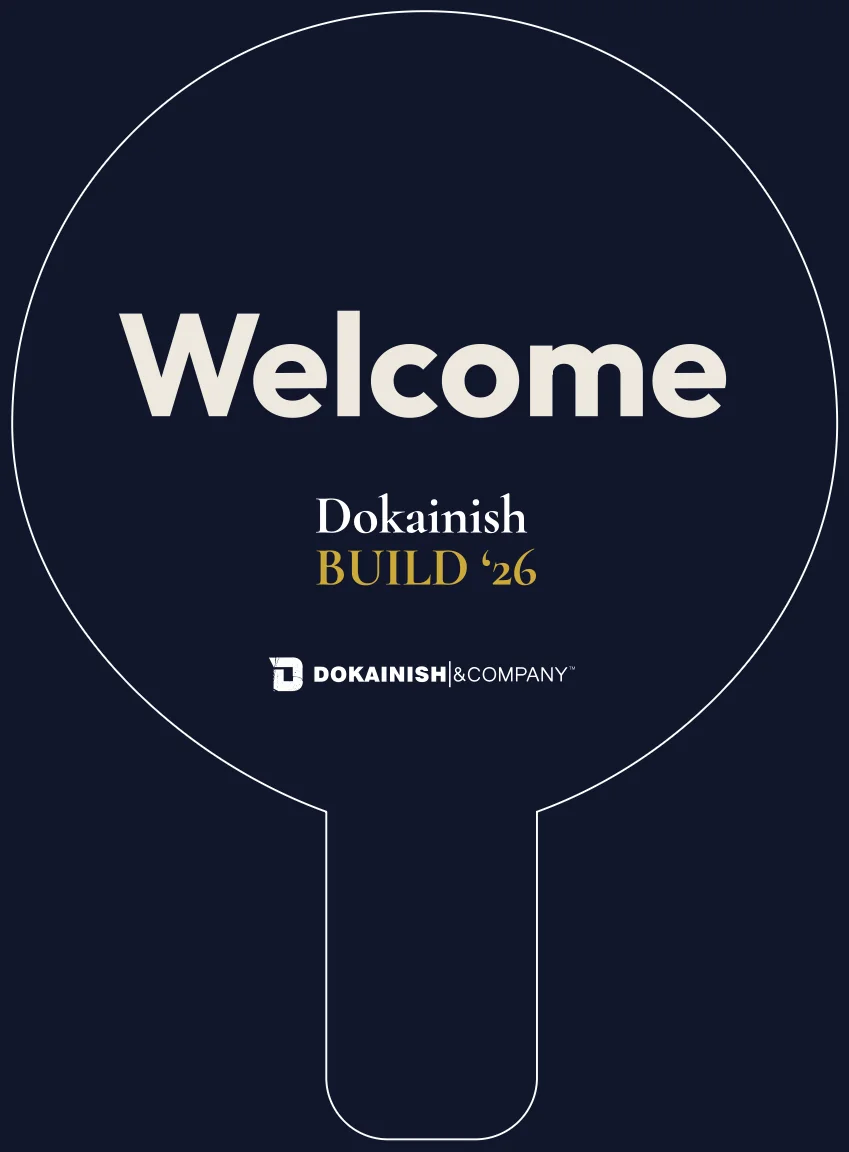
Welcome boards, directional signage, identification
04
Digital
Social assets, screens, campaign graphics, event content
03 / PHYSICAL SPACE
Designed for the room, not just the artboard.
Large-format work has to account for scale, sightlines, architecture, seams, materials, viewing distance, and how people actually move through a venue. I design environmental graphics with the installed space in mind so the brand remains clear and intentional once the artwork leaves the screen.
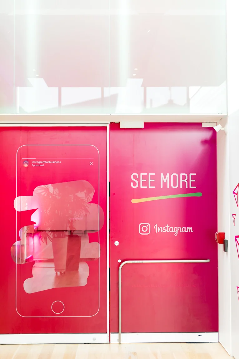
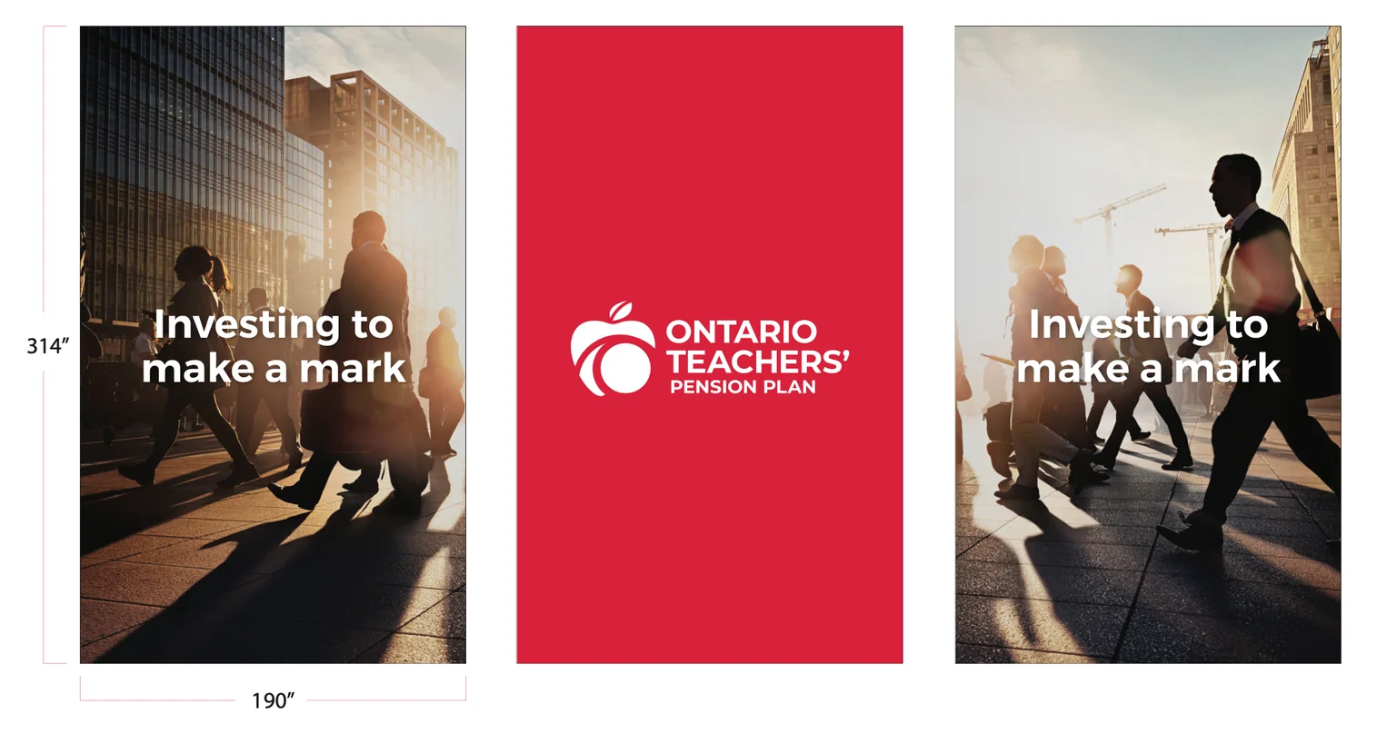
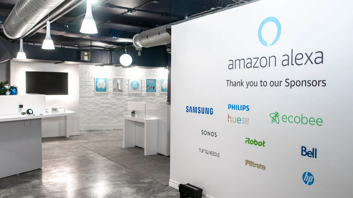
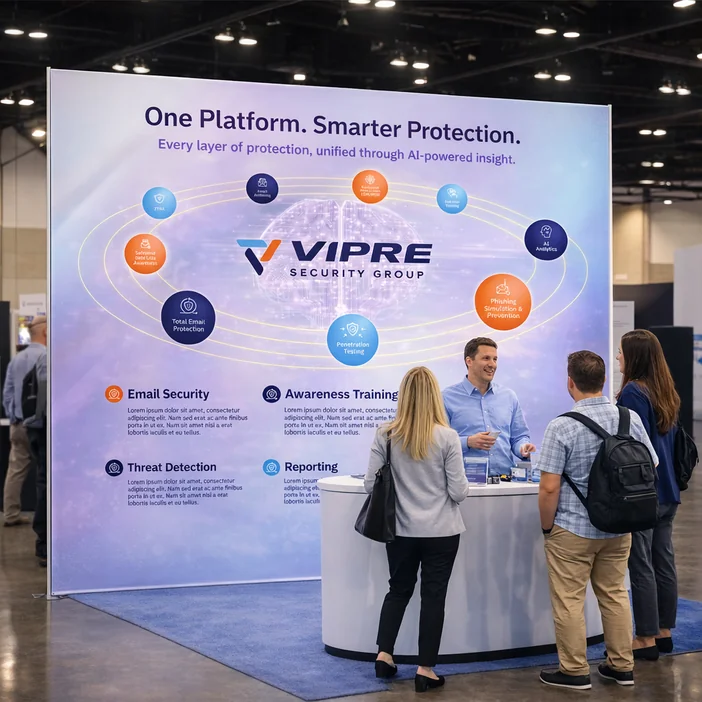
Selected environmental graphics, from Instagram door wraps and Ontario Teachers’ window panels to Amazon Alexa event walls and VIPRE exhibition displays, adapting each brand to its physical setting.
05 / DIGITAL + SOCIAL
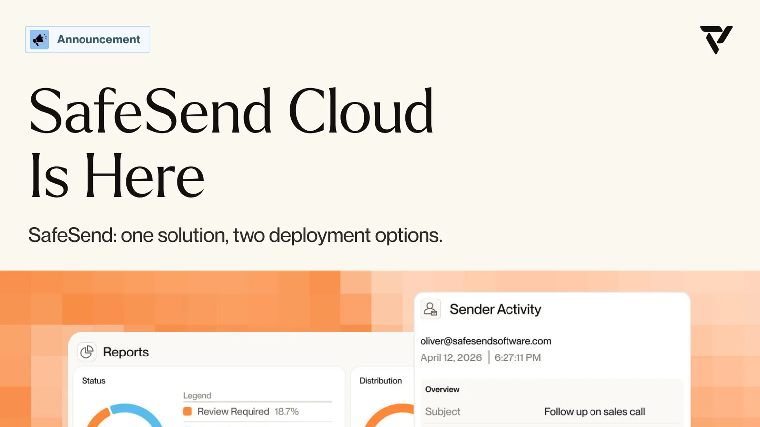
Taking a new brand into the feed.
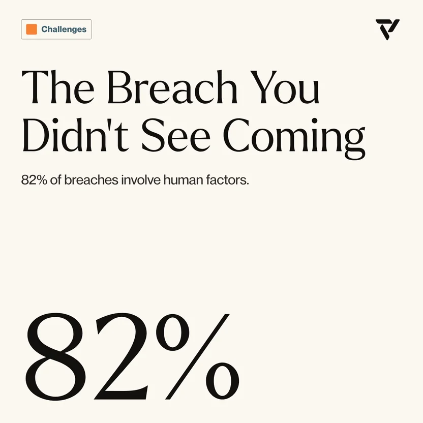
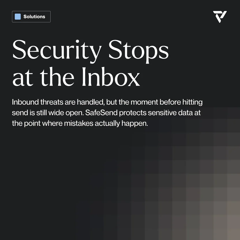
SafeSend’s brand had just been established, with guidelines provided. I translated that foundation into social campaigns for LinkedIn, X, and Instagram, adapting each asset to the platform’s size and layout.
LINKEDIN / X / INSTAGRAM
Headlines, imagery, and spacing were recomposed for square and widescreen formats while staying true to the supplied guidelines.
06 / PRODUCTION + OUTCOME
Good visual design has to survive production.
Good visual design has to survive production. Files need to account for dimensions, bleed, resolution, panel breaks, unusual surfaces, platform requirements, and different output methods. Working across both digital and physical formats means carrying the visual intent all the way from the initial layout to the final installed, printed, or published piece.
01
Large format
Built for real dimensions and viewing distances.
02
Print ready
Bleed, safe areas, resolution, and output considered from the start.
03
Multi-format
Systems adapted across environmental, print, and digital assets.
04
Brand consistent
Existing standards preserved across every application.
PROJECT CONTEXT
Selected work completed through Yellow House Events, The Goods BMC and New Wonder. Brand identities remain the property of their respective organizations.
