Atlas Design System
A Figma design system built for complex work. Shared foundations, reusable components, and resilient patterns for operational teams.
SERVICE OPERATIONS / DASHBOARD
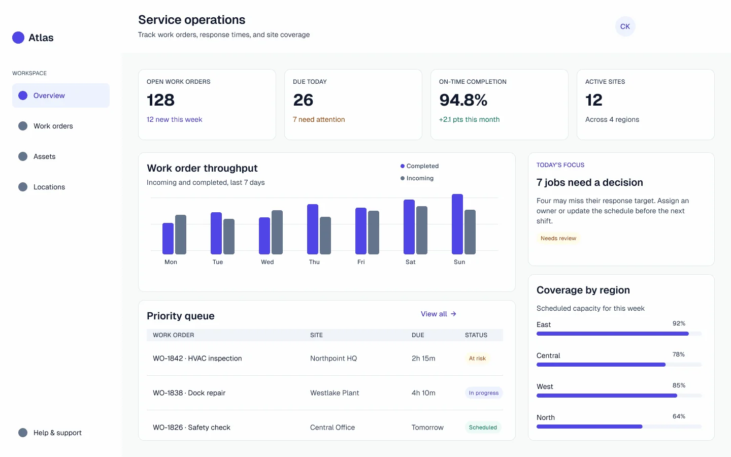
01 / SYSTEM OVERVIEW
From foundations to product patterns.
Built in Figma, Atlas connects raw values, semantic roles, components, interaction states, and product guidance into one working system for complex operational software.

Foundations
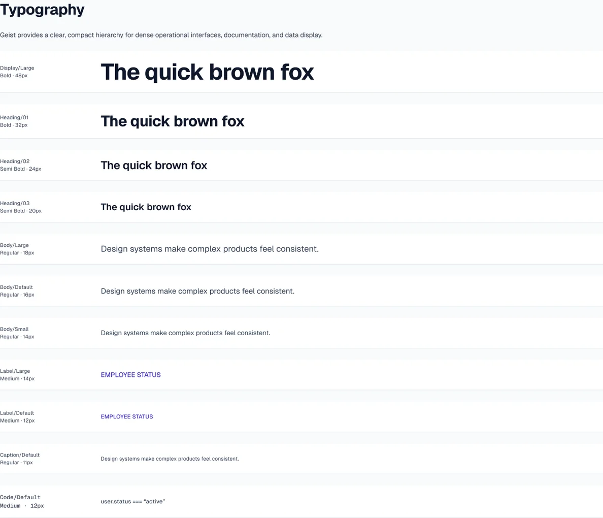
Primitive and semantic color, light and dark modes, type, spacing, radius, and elevation.

Components
Buttons, icon buttons, fields, selection controls, navigation, feedback, identity, and overlays.

States & properties
Size and intent variants, focus, hover, disabled, validation, selection, and content properties.

Patterns
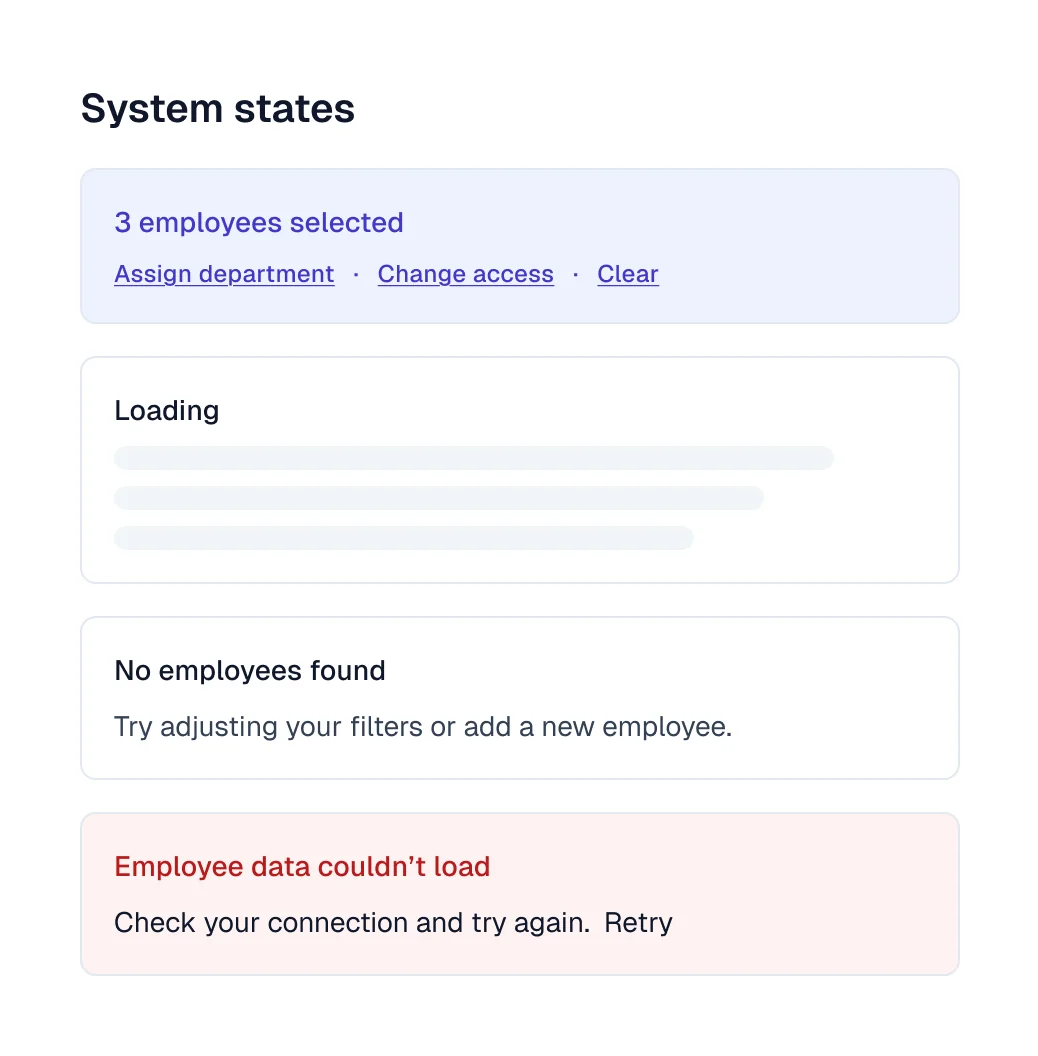
Searchable data tables, bulk actions, pagination, step progress, section return, and system states.

Accessibility
Contrast targets, focus cues, persistent labels, noncolor status, target size, and keyboard guidance.

Documentation
Purpose, usage, Figma component properties, product examples, and a release checklist for new patterns.
02 / FOUNDATIONS
A decision layer, not a palette.
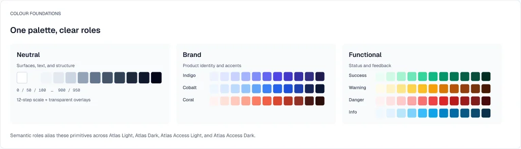
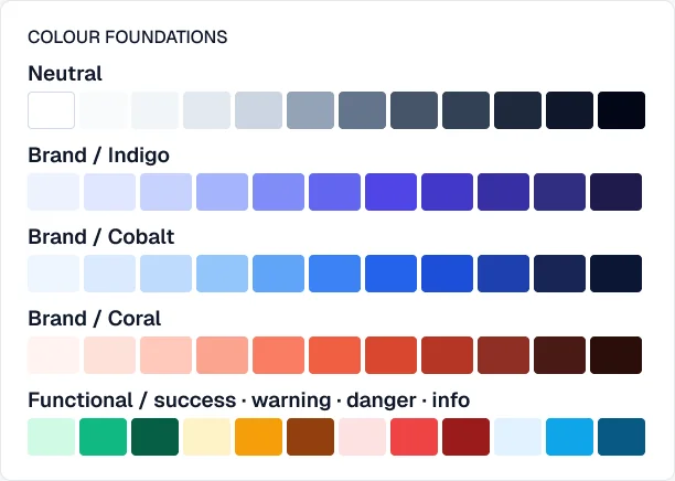
Figma variables separate raw values from semantic roles. Components reference those roles so light and dark surfaces can change without rewriting the meaning of each control.
01
Primitives
Neutral, cobalt, and status scales provide the source values.
02
Semantic roles
Surface, text, action, border, and status names encode intent.
03
Component decisions
Tokens meet type, spacing, radius, and elevation in reusable controls.
04
Applied patterns
Tables and workflows combine the controls in realistic operational contexts.
03 / COMPONENTS
Designed beyond the default state.
Built as Figma component sets, each family covers size, intent, and interaction states. The examples below show the actual variants and properties, including visible focus and validation cues.
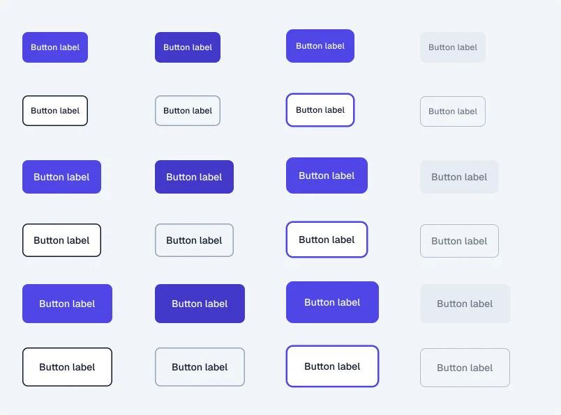
BUTTON / 24 VARIANTS
One action, many contexts.
A simple visual foundation with flexible controls built in. Three sizes, primary and secondary styles, and default, hover, focus, and disabled states cover the essentials.
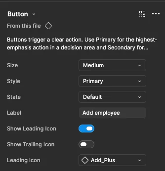
In Figma, editable labels, optional leading and trailing icons, and icon swapping let each button adapt to its context. These controls keep the component library compact while giving designers room to work, without detaching instances or creating one-off variations.
TEXT FIELD / 5 STATES
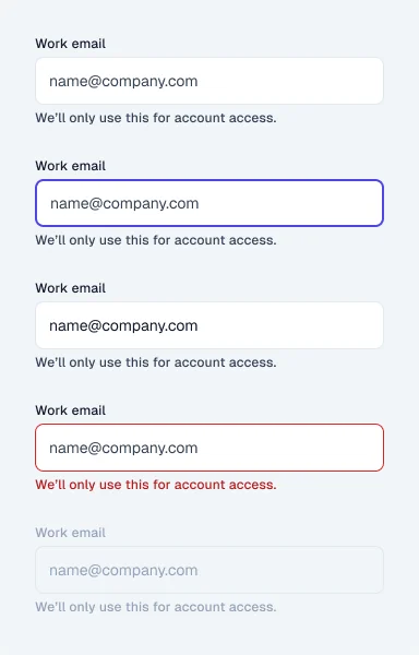
Validation stays explicit.
Persistent label and helper text support default, focused, filled, error, and disabled states.
FROM COMPONENTS TO PATTERNS
Buttons, fields, filters, status treatments, and table controls inherit the same Figma variables and component logic. This makes it possible to build dense operational workflows without redesigning core behaviour for every screen.
04 / COMPLEX DATA
The table is a product pattern.
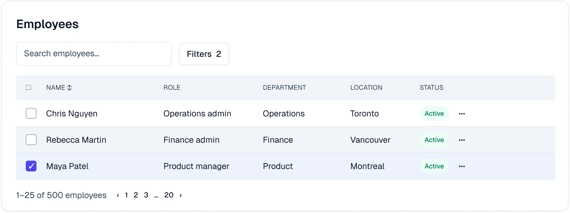
A dense table needs more than clean rows. Sorting, filters, selection, bulk actions, pagination, and recovery all have to remain legible at once.
Selection has a consequence
A selected row is reinforced by a checkmark and surface treatment, then exposes meaningful bulk actions.
System states are designed
Loading, empty results, and data failure each explain what happened and provide an appropriate next step.
Density serves the task
Headers, status, pagination, and row hierarchy support scanning without reducing core table text to metadata size.
05 / ACCESSIBILITY + GUIDANCE
Rules that travel with the work.
The Figma library documents what each pattern must preserve when it moves into product screens: readable text, visible interaction cues, keyboard support, and usable recovery.
4.5:1
Normal text contrast target for essential content.
2 px
Focus ring with enough separation from a component border.
44 px
Minimum interaction area for primary controls.
2+ cues
Status pairs color with text, iconography, or state.
BEFORE A PATTERN GRADUATES
Keyboard, zoom, labels, status, focus, motion.
Atlas includes accessibility criteria for keyboard navigation, 200% zoom, accessible naming, non-colour status indicators, visible focus states, and reduced motion. These are built into the design and release process as ongoing quality standards.
06 / BUILT TO BE USED
Focused by design, reusable in practice.
Atlas has been used across several client engagements and chosen over broad libraries such as Material UI or Tailwind-based component kits. Its focused Figma foundation keeps only the components, states, patterns, and accessibility guidance each product needs, avoiding unnecessary overhead while preserving the details that make complex interfaces clear, dependable, and distinct.
